The Wonderful World of Color
Logo and brand would be nothing without thoughtful use of color. Can anyone think of Coca-Cola without envisioning the color red? There is a reason it’s called “John Deere” Green or “Tiffany” blue, because the color has become synonymous with the brand. Color selection is vitally important with respect to a brand and decisions regarding color use in marketing pieces should not be taken lightly.
In order to make decisions about effective use of color, one must understand the color wheel.
The Color Wheel
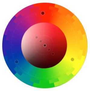 The color wheel is an important tool to use when determining color usage in a logo, newsletter, collateral piece or even a business card. Understanding its makeup and relationships is critical to making informed choices about how to use color in a marketing piece.
The color wheel is made up of three different types of colors:
Primary Colors
Red, blue and yellow
Secondary Colors
Colors that you get when you mix an equal amount of primary colors:
Yellow and blue make green, red and blue make purple, red and yellow make orange.
Tertiary Colors
These are colors that fill in the color wheel, mixing equal parts of primary and secondary colors, making colors like blue-green and yellow-orange.
Color Relationships
By using the color wheel effectively, color combinations can be created that are sure to work. The following color wheel examples were created with a great online tool called Adobe Color, which can be found at color.adobe.com, and is a great way to play with possibilities.
Types of Color Combinations:
Complimentary
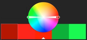 Complimentary colors are colors that are directly across from one another on the color wheel and are in essence opposites. Selecting complimentary colors in a graphic design piece can lead to bold color combinations such as: Red and
  Green, Blue and Orange, Lime Green and Violet
Triads
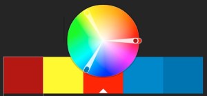 Triadic colors are a set of three colors that are equally distant from one another on the color wheel. This can provide a pleasing palette of colors that are quite different to one another but work well together. Examples of Triadic Color combinations: Red, Yellow, Blue; Purple, Yellow-Orange, Aqua; Lime Green, Blue-Purple and Red-Orange.

Split compliment triads
Another way to select a color combo is to select a color, then chose the two colors on either side of that colors compliment across the color wheel. These split compliment colors can be slightly more refined than traditional triad combos. Examples of this include:
Green, Yellow, Violet
Orange, Blue-Purple and Blue-Green
Analogous Colors
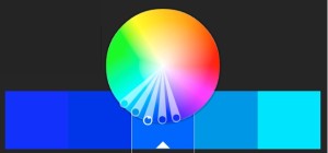 Analogous color combinations are colors next to one another on the wheel. You may choose two or three colors to create an analogous color palette.
The BP logo, with its greens and yellow, uses analogous colors to great effect.
Shades and Tints
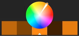 The basic color wheel only involves pure colors, or hues, but variations of pure color can be created by adding black or white. Using shades or tints of pure colors expands the color wheel greatly and gives much more variety when selecting a color palette for graphic design projects. When discussing shades and tints, it is important to know your terminology. A hue is the pure color. A shade adds black to a hue, while a tint adds white to the original color.
Monochromatic
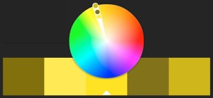 Monochromatic color combinations are used by selecting different shades or tints of the same hue. Consider the logo for Animal Planet.
Black and White
Let us not forget about the option of forgoing the color wheel altogether and opting for the more dramatic, cost-effective, black and white. Which, when done correctly, can  be absolutely stunning.
The next time a project calls for design work, take a good look at the color wheel, understand how the various colors relate to one another, and determine what color combinations work best to deliver the message of the piece.


