Categories

Focus on: Rebranding

FOCUS ON

Rebranding

Tripepi Smith has helped several clients update their brand. Rebrand projects present challenges beyond those faced when branding with a blank slate. In the case of rebrands, the development of the organization’s new identity contends with its existing one.

Research and outreach must analyze perceptions and usage of the current brand, and implementation must have a strategy for dealing with both the physical and emotional presence of existing identity. Existing stakeholder groups provide an important opportunity for insight into where the brand has been and where it could go. Careful analysis of the organization’s history, culture(s) and vision for the future provides context for creative development, while strategic engagement with organization staff informs implementation strategy. There is an art and a science to designing meaningful logos and associated brand elements. With rebrands, that art and science is doubly important.

This page focuses on Rebranding, you may also be interested in:

Sub-branding

Brand Augmentation

And of course, feel free to review our full portfolio.

City of Pinole: Rebrand of Logo & Seal

In 2024, the City of Pinole announced the adoption of a new logo, seal and brand guidelines. Spearheaded by collaborative efforts between Pinole city officials and Tripepi Smith Creative Director, Kevin Bostwick, and Senior Business Analyst, Karen Villaseñor, the new design marks a significant milestone in the city’s journey towards revitalizing its identity. The decision to embark on this transformative endeavor stemmed from a collective recognition among city staff that the existing seal, a fixture for over 40 years, required a refresh to better reflect Pinole’s evolving ethos. Initially conceived as an homage to local indigenous history through the depiction of an Ohlone man, it became evident that contemporary perspectives warranted a reevaluation of such representations.

In collaboration with Tripepi Smith, Pinole navigated a comprehensive process of creative exploration and public engagement. Multiple options were developed for consideration, with input solicited through digital surveys, employee feedback sessions, social media channels, and direct consultations with community members at city events, and further consultation with the Confederated Villages of Lisjan. The adopted logo and seal iconography contain elements referencing touchstones of Pinole’s identity: water and movement (bay and creek), basket artistry of the Ohlone (a circular element representing community, plenty, and the interconnectedness between generations), a hawk representing vision and stewardship of the land, native oaks and acorns (central in the City’s name), friendly rolling hills and the warmth of their sunsets.

City of Hawthorne: Rebrand

The City of Hawthorne was proud to unveil a striking new logo, a visual representation of unity, progress, and community pride. Collaborating with Tripepi Smith, the City embarked on an extensive design journey that involved input from various stakeholders across the community. The creative process began with a comprehensive brainstorming phase, shaped by reflections on Hawthorne’s history and vibrant community. Engaging in meaningful conversations with diverse stakeholders ensured a comprehensive understanding of the City’s identity and aspirations.
Tripepi Smith designers crafted a logo that encapsulates several of Hawthorne’s landmarks, including the City’s water tower, airport, and Betty Ainsworth Sports Center. It also features striking iconography that evokes a Californian setting and ties to the aviation industry. One of the logo’s most distinctive features is a rocket that swoops across the frame, symbolizing Hawthorne’s dedication to progress and innovation.

“The creation of our new City logo was a collaborative effort that spanned multiple city departments, reflecting the unity and diversity that defines Hawthorne,” said City Manager Vontray Norris. “This visual representation not only captures our City’s rich history but also sets the stage for a forward-looking future.”

City of Maywood Centennial Logo Reveal

City of Maywood: Logo, Tagline, Centennial Logo

When the City of Maywood celebrated its 100th anniversary, Tripepi Smith was there to unveil the new logo and tagline as part of the Centennial Celebration. Tripepi Smith was commissioned to rebrand Maywood in time for this milestone event. Community input and collaboration with City staff were key in developing a logo inspired by the art-deco style of City Hall and local street monuments, while also reflecting Maywood’s focus on family and heritage. The new tagline, “Small city. Where our traditions meet tomorrow,” sums it up. In addition to the new Maywood logo, Tripepi Smith also created a special 100-Year logo for the Centennial. “Tripepi Smith was instrumental in designing our new logo that not only captured the essence of the City but also stands as a beacon of our shared vision for the future,” said City Manager Jennifer Vasquez. “From initial research to final designs, the process stayed true to our community’s history and future. We’re excited to implement the new brand, starting with our centennial celebration, and continuing into the future.”

Institute for Local Government: New Logo, Brand Statement & Pillars

ILG’s pre-existing brand was dated, so they partnered with Tripepi Smith to create a new logo and tagline that better reflects who they are and what they do. Tripepi Smith created a stakeholder survey and helped ILG navigate the creative process and Creative Director, Kevin Bostwick, workshopped the development in-person with the ILG board. Research indicated that ILG continues to be strongly associated with green, so the design is a rethinking of green as a foundation for a new set of colors. The iconography creates a sense for the kinds of agencies served (cities, counties, special districts) and reflects different regions of California (sea, mountain, agriculture). Tripepi Smith’s brand research informed the creation of a new tagline and is the basis for a new ILG Brand Statement and associated Brand Pillars.

City of Norwalk: Rebrand

The City of Norwalk had a dated logo and motto from the 1980s that had not kept up with the growth and evolution of the City. Tripepi Smith took the logo rebrand process from start to finish, from stakeholder engagement to delivery of final assets and guidelines. See our full showcase for this client: https://www.tripepismith.com/portfolio_page/city-of-norwalk/

Pivot Charter School logo

Pivot Charter Schools: Full Rebrand

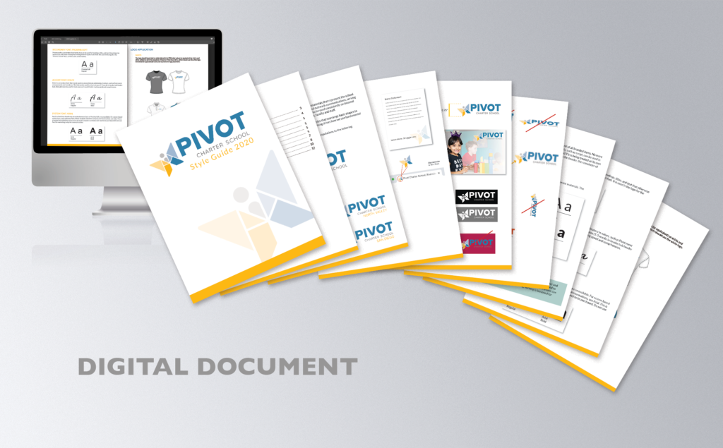
In 2020, Tripepi Smith delivered a complete rebrand for Pivot. After several interviews, Tripepi Smith helped Pivot formulate a mission statement and brand pillars. Next, the logo redesign process landed upon a new look, with a butterfly to represent the spirit of Pivot and its students, built from traditional educational “tangram” shapes. Tripepi Smith then developed comprehensive Brand Standards to inform all design moving forward. Finally, for the virtual celebration rolling out the new brand, Tripepi Smith created an animation introducing the new logo.

Full Pivot Showcase

North Los Angeles County Transportation Coalition (NCTC): New Logo

At the very end of 2020, the NCTC decided it was time to update their logo. Tripepi Smith presented several concepts that better reflected their vision, mission and professionalism. Tripepi Smith provided a full logo library, including: horizontal version, vertical version, color/B&W/white, social media icon, and web development formats for NCTC to pass along to their web developer. As of January 2021, we look forward to how the new logo will inform their updated website.