Design Trends: Using Visual Design for Authenticity
For several years, design has reflected an increasing emphasis on connecting with audiences in an earnest and empathetic way: a trend that can be summed up as visual authenticity. Content creators and writers are also moving in this direction, accelerated by the advent of fake news and a global pandemic. In a world that feels less certain, audiences are gravitating towards communications that look and feel earnest, trustworthy and relatable. This trend impacts all sorts of design. Striving for “authenticity” within our work for public agencies presents certain challenges.
For a long time, design worked to reflect a voice of authority, to “elevate” brands by conveying professionalism, expertise and confidence. It’s easy to picture what I’m talking about: photos of people with arms crossed staring at the camera, executives in glassy high-rises, background patterns that look like technical diagrams, big blocks of confident color contrasts. Heck, I’ve done plenty of designs like this, and really, what’s wrong with professionalism, expertise and confidence? Nothing. Except they are increasingly interpreted as arrogant, exclusionary and dominant. People’s expectations for design are shifting towards human connections and playfulness. You can see this change mirrored in visual design (e.g. take a look at these Fall fashions).
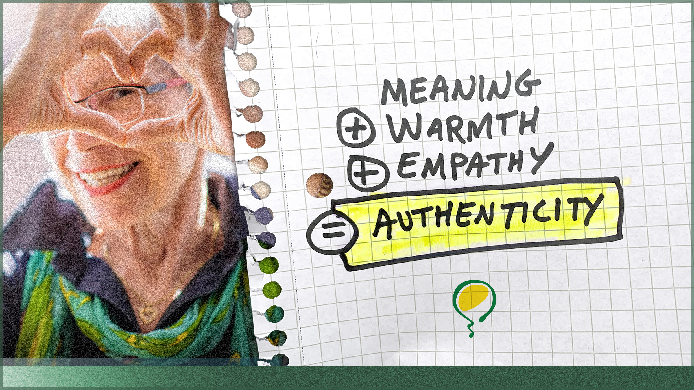
Authenticity = Meaning + Warmth + Empathy
You may think authenticity is just about being truthful, but authenticity requires more than just facts:
- Meaning: Because design that fails to build understanding feels pointless.
- Warmth: Because it’s no longer OK to just be cool.
- Empathy: Because messaging that understands what it is like to walk a mile in our shoes is more likely to gain our trust and engagement.
Authentic design can achieve this even when the subject matter isn’t warm and fuzzy. Take Ernst & Young, one of the largest professional services networks in the world—not what I would call especially “relatable.” But when I look at their website, I see photos of diversity, laughter, greenspace, hope—even their tagline is empathetic (“Building a Better Working World”).
Impact on Public Agency Design
Authentic design should be easy for public agencies, right? They literally serve the public and their issues are about real people doing real things in real settings. I mean, what’s more relatable than information about summertime activities in a Parks & Recreation brochure, accompanied by photos of smiling kids? But it’s not always that easy; cities and public agencies are often perceived negatively as authority figures. Their communications can’t help but include uncomfortable truths, controversial initiatives and regulatory minutiae.
Authentic visual design can help offset that prejudice and give users a chance to engage with the message in good faith. So, how can your design convey authenticity even when the message is difficult? Or especially when the message is difficult? As you design, ask yourself these questions:
Meaning:
- Is your design obscuring or minimizing the main message? Don’t sugarcoat.
- Can the design make a message feel less commanding? Remember that the core meaning of many difficult truths, even enforcement issues, is that they are important to all of us (e.g. “we’re all in this together”). Design can help drive this meaning home.
- Can the design simplify the complexity? It’s important to have the design put focus on the main, simple take-away. In many cases, infographics and illustrative imagery can help transmit meaning more simply.
- Can the design avoid a sense of taking sides? Imagery and graphics can navigate controversial messages by reflecting “just the facts, ma’am.” Design can also reflect that not all things will mean the same thing to everybody by reflecting democracy or conversation (e.g. images of town meetings or a montage of real people).
Warmth:
- Can you include human-oriented photos of shared experiences? This conveys that the priority is the wellbeing of your community, even if the message is difficult.
- Can you make the design friendlier without seeming like you are trivializing?
- Can the design reflect diversity, culture, history or local identity? This creates a sense of “being seen” and that you, too, value what makes your audience special.
Empathy:
- Can your design be made to feel more helpful or sensitive? Difficult messages create pain points in audiences, like “I don’t understand” or “this is upsetting.” Being empathetic helps create visuals that recognize those pain points and build engagement.
- Is your design falsely cheerful or tone-deaf? It’s important to recognize when all of your audience may not feel great about the message. Empathy means identifying with people’s concerns, even if they are not yours.
- Can your design be adjusted to better reflect community goals or values?