Why Typography is Important
Merriam-Webster defines typography as the style, arrangement or appearance of typeset matter(1). This visual art form, which includes the shapes, sizes and spacing of letters, affects all collateral, from press releases to web and social media pages to logos and brochures. Its consistent use throughout an organization’s collateral reinforces brand integrity and impact, as demonstrated by big-name brands such as Google, Nike or the L.A. Times.
Public agencies should employ similar consistency when choosing or defining typography. All cities have multiple departments that make up the organization; often we find that Public Works uses one font while Parks and Recreation uses another, and so on. This creates inconsistency throughout the organization and makes it difficult to have a clearly defined brand identity as an agency.
When it comes to choosing typography for your brand, it is important to select a style, size and format that represents the look and feel of your brand and ensures consistency throughout your organization.
“Good typography should set the tone for your message,” says Melanie James, business analyst and graphic designer. “The objective is to make it easy to read and practically unbeknownst to the reader.”
Typefaces, which are made up of fonts, or graphical representations of text, may include different styles, sizes, weights, colors or designs. Most fonts are categorized as one of these three styles:
 (2)
(2)
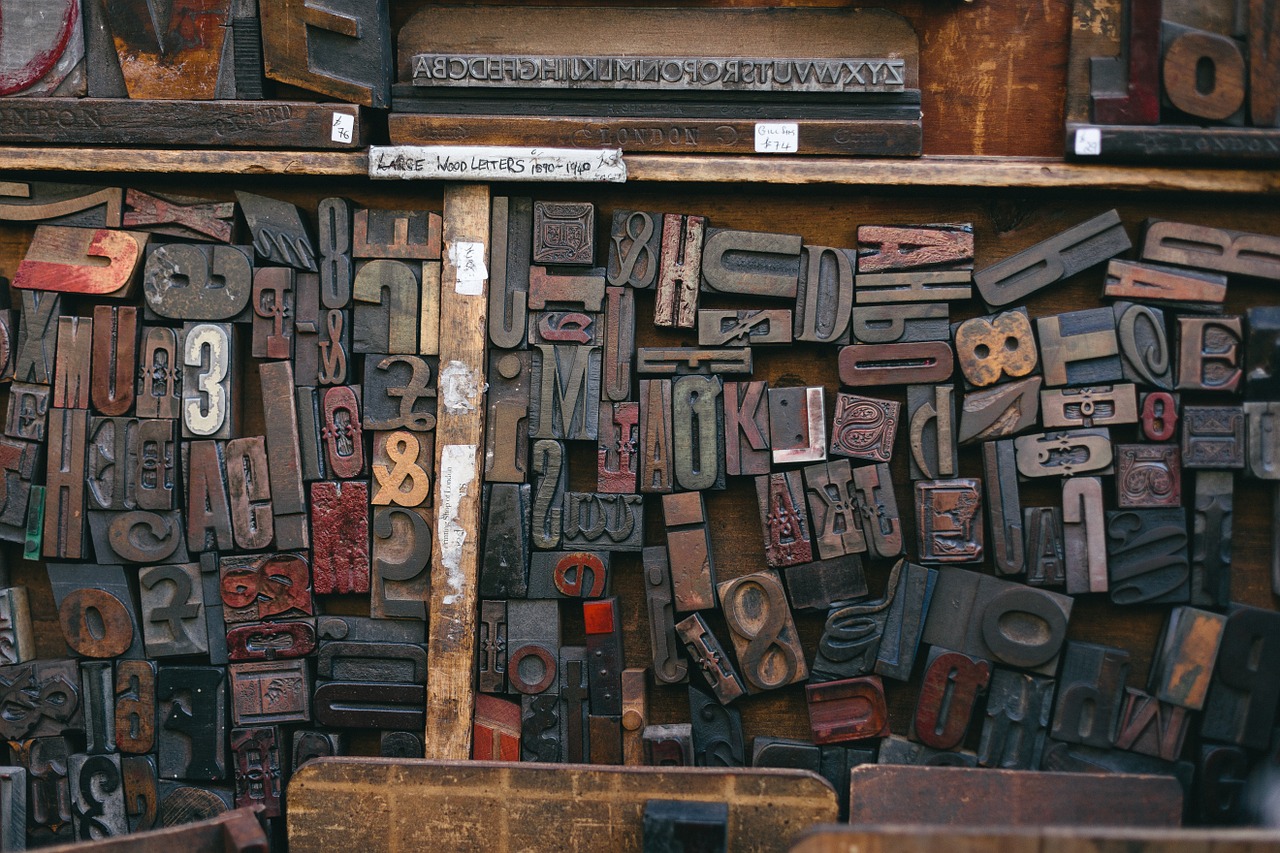
Serif(3): a typeface that includes short lines stemming from and at an angle to the upper and lower ends of the strokes of a letter
 (2)
(2)
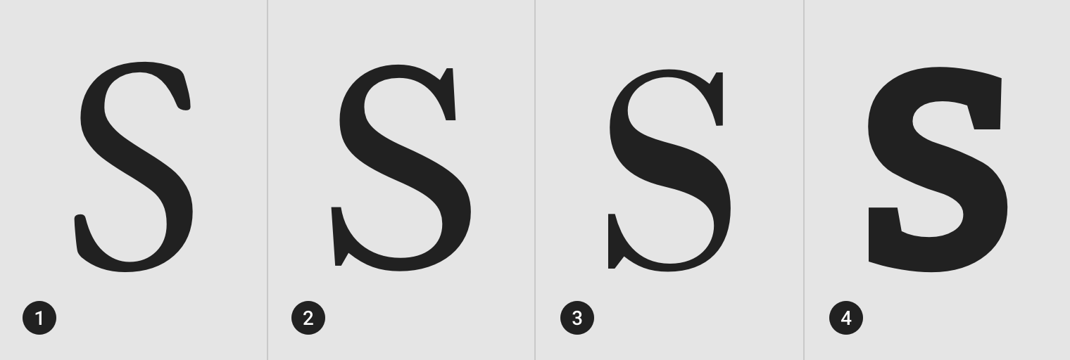
Sans Serif(4): a letter or typeface without serifs
 (2)
(2)
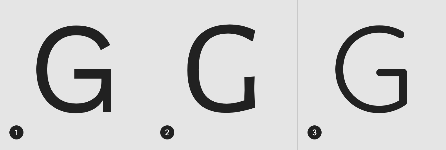
Script(5): a style of letters or typeface that resembles handwriting
Each font type can change the mood and message being portrayed. Serif fonts often are favored for their readability and traditional style, whereas sans serif fonts are perceived as more modern. Script fonts may accent a word or title as part of a larger design, but—except in some cases, such as formal event invitations—usually should not be used as the primary body text.
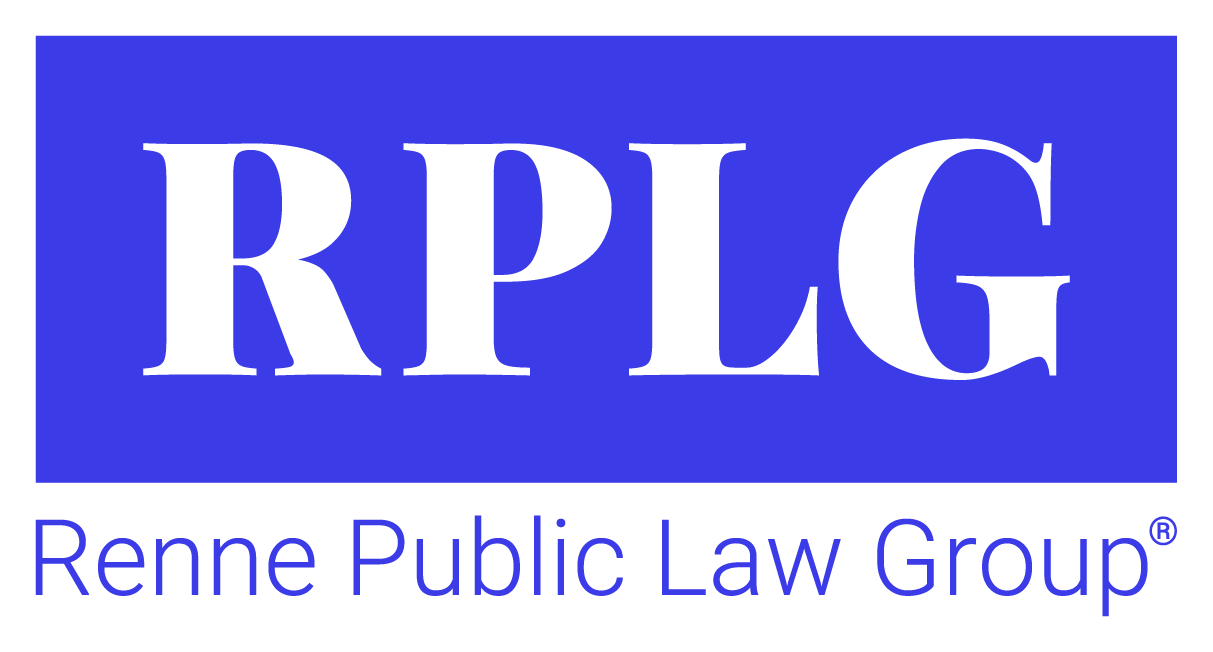
Minor adjustments to the structure or alignment of a series of letters may have major impact, as in the case of the logo of the Renne Public Law Group (RPLG).
RPLG’s original logo design was a simple monogram—RPLG—presented in Playfair Display Black, along with the words Renne Public Law Group in Century Gothic Regular. With default spacing between the letters and the typeface enlarged, the “R” and “P” appeared too close together, while the “P” and “L” appeared too far apart. Designer Melanie adjusted the kerning—the space between the letters—to create a custom alignment within the group. In order to further refine the logo, Melanie also created a custom letter R, using the downstroke from a letter K.
BEFORE:
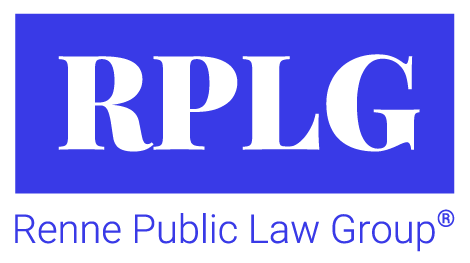
These small changes resulted in a more balanced, visually appealing logo.
Popular Typefaces for City Agencies
-
-
- Garamond
- Times New Roman
- Trajan Pro
-
-
-
-
- Arial
- Avenir
- Lato
-
-
If you think your logo may benefit from a similar facelift, please contact Tripepi Smith.
1 – Source: Merriam-Webster – merriam-webster.com/dictionary/typography
2 – Source: Material Design – material.io/design/typography/understanding-typography.html#type-classification
3 – Source: Merriam-Webster – merriam-webster.com/dictionary/serif
4 – Source: Merriam-Webster – merriam-webster.com/dictionary/sans%20serif
5 – Source: Merriam-Webster – merriam-webster.com/dictionary/script