New Year, New Color: Pantone’s 2022 Color of the Year
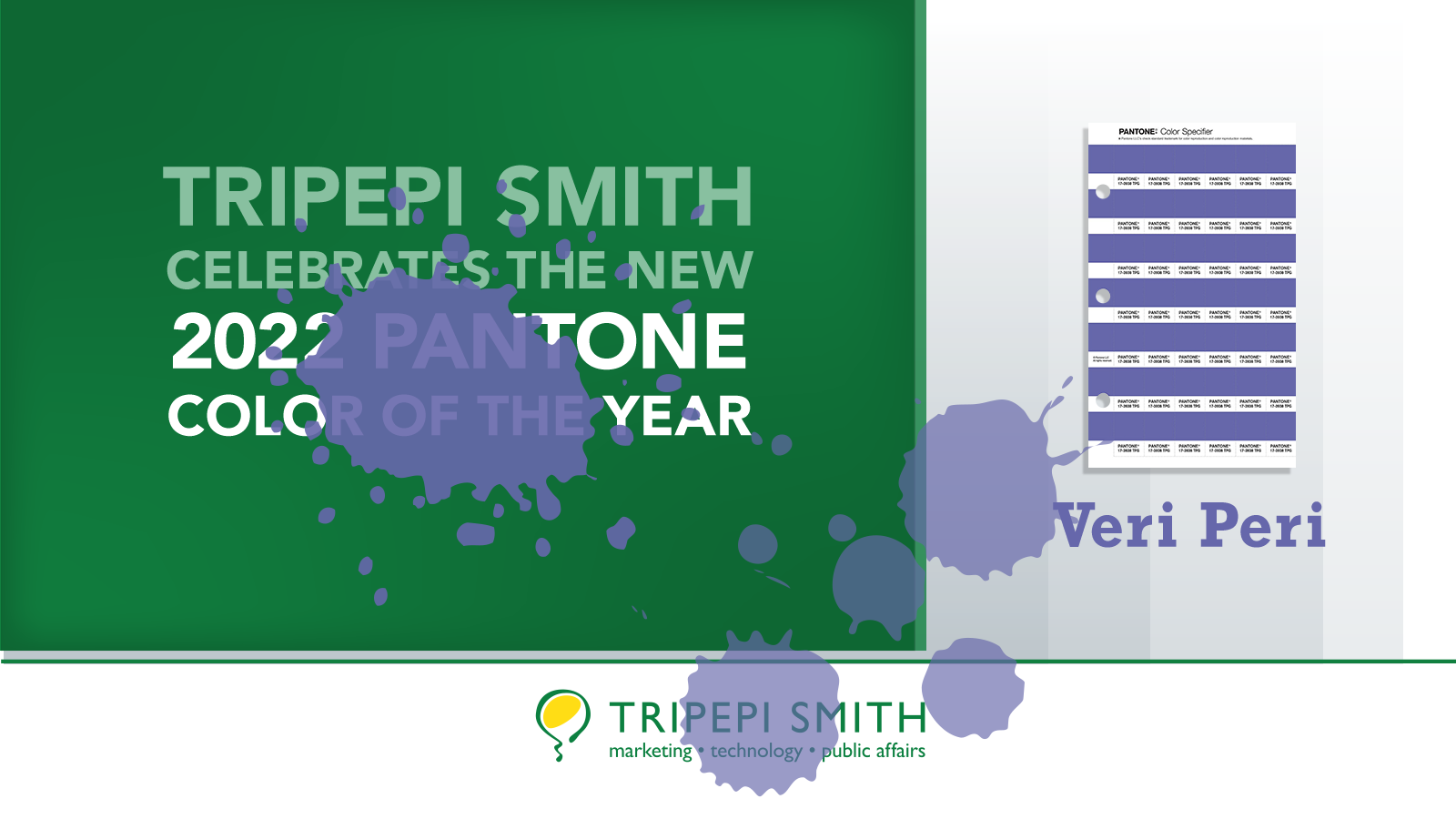
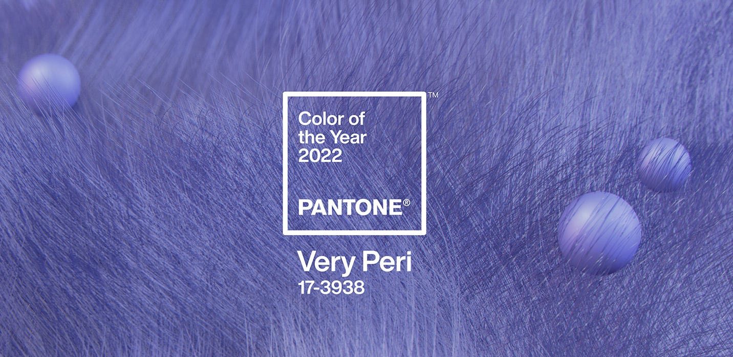 The Pantone Color Institute has announced their 2022 Color of the Year: Very Peri. For the first time ever, Pantone mixed up a brand new color for the annual Color of the Year announcement.
“The selection of PANTONE 17-3938 Very Peri brings a novel perspective and vision of the trusted and beloved blue color family, encompassing the qualities of the blues, yet at the same time with its violet red undertone, PANTONE 17-3938 Very Peri displays a spritely, joyous attitude and dynamic presence that encourages courageous creativity and imaginative expressions,” said Leatrice Eiseman, the Executive Director of the Pantone Color Institute.
While we know that gushing excitement over this announcement can be overdone, Tripepi Smith does appreciate how Pantone’s annual announcements force us to consider opportunities to shake up our color complacency. Dropping a fresh, trending color into your design can re-engage audiences with unexpected splashes of color. And while Tripepi Smith loves all our clients that keep within their brand guidelines—that doesn’t mean they can’t infuse their materials with color excitement. Pantone Veri Peri for example.
Here are some ideas for integrating Very Peri into your work:
1. Campaign Branding
Your overarching brand color family doesn’t include Veri Peri (it’s brand new!). Consider using it for a particular initiative or campaign, giving the materials a distinct look and feel. Very Peri can brighten up your brochures, business cards, conference swag and logos. If you are concerned about brand consistency, use the white version of your logo on a Veri Peri background, or create layouts that are largely Veri Peri but with footer or sidebars of your branding. That way, you’re staying within brand while still updating your colors with a twist.
2. Social Media
Update your social media with a splash of Very Peri! The transitory nature of social media content makes it a great place to experiment with unexpected color. Consider creating a 3 or 4-week social media conversation on a cheerful topic, using Veri Peri to tie the imagery together.
3. Offices
Consider incorporating accent items such as decorative pillows, wall decor, balloons, coasters, mousepads, vases, magazine stands, bookends or picture frames to brighten up your space. Periodically freshening up your environment is a life hack—particularly to keep the creative juices flowing!
4. Admit It
A simple way to include Veri Peri in your social media is to simply admit it: “Having fun with Pantone’s new Color of the Year!”