You Like Your Logo, So Why Does It Keep Disappointing You?
What if you have a likable logo but it just doesn’t seem to be working as it should?* Don’t worry! Lots of brands have this issue, particularly those of public agencies, so here’s a question: are you asking your lonely logo to do too much all by itself?
The best brands have a system of logo assets, not just a single logo. A power drill offers different bits to swap in safely for different tasks. The best logo libraries also work this way, with expanded options and clear guidelines that solve real-world design scenarios. Keeping your logo out of trouble supports a stronger brand which, in turn, makes your materials more professional and builds trust in what your organization has to say.
Below are 7 sins that can turn a good logo bad, along with solutions to get your logo back to a healthy place. Many of these solutions require a designer’s assistance to tune things up—but once done, you will find your logo stops disappointing you and starts being the brand ambassador you always knew it could be.
*If you don’t like your logo, then it’s time for a rebrand—but that’s a whole different topic! Start the conversation with Tripepi Smith.
Sin #1: The Pixelated Logo
If all you have is a low-resolution logo file, chances are that it’s showing up blurry. This happens when image files are enlarged more than their recommended resolution. Note that this is particularly true in print—recommended resolution quality is about three times for print than on screen.
Solution: Identify high-resolution files of your logo or, even better, identify a “vector” format that can output crisply at any size (.ai (Adobe Illustrator) and .svg are vector formats). If you don’t have files like this, consider asking a designer to rebuild your logo as vector art.
Hint: High-quality JPEG or PNG files usually have a file size of at least a megabyte or two.
The Caveat: Most non-designers can’t just click and open a vector file (though they ARE placeable into things like Microsoft Office). If you have a vector format logo, it’s relatively easy for a designer to quickly export high-resolution JPEG or PNG files that many people are familiar with.
Sin #2: The White Background
Lots of logo files have white backgrounds. This can look awkward when laid on top of a non-white design. Plus, it can cramp your logo like in the example above. Some file formats, like JPEG, are unable to have a transparent background.
Solution: Once again, a vector version solves this problem, as do certain high-resolution pixel versions set with transparency, like PNG (or Photoshop PSD for designers).
Sin #3: The Color Fail
Most people understand that logos shouldn’t be altered with non-brand colors. But relying only on your color version is a recipe for failure. It can also lead to accessibility challenges when designs have insufficient contrast.
Solution: Ensure your logo library has the basic versions necessary for different design scenarios. At a minimum, you want White, Black and Gray versions. You may also want a 1-color version (as opposed to multi-color). Creating these options is particularly easy if you have a high-quality vector or transparent version already (see #1 and #2 above).
Sin #4: The Orientation Fail
The space in a design open for your logo doesn’t come in just one shape, so there’s going to be trouble if your logo is just one shape.
Solution: Strong logo libraries typically have both horizontal and vertical (or “stacked”) configurations.
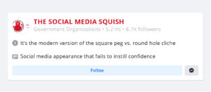
Sin #5: The Social Media Squish
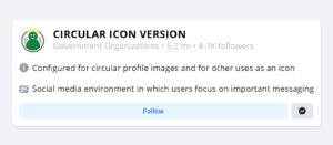
Sometimes a simple icon is necessary, and sometimes it needs to be circular.
Solution: Ensure your logo library includes special versions like a circular icon. Not all logo art translates easily; if it does not, consider a simplified solution using your brand color and a very basic piece of your logo, or even initials.
Sin #6: The Brand Chaos
The 5 sins listed above can all be solved by building out your logo library with formats that work in different design scenarios. But the reality is that even robust logo libraries will fail if people abuse them. Not everyone understands that brand consistency builds the recognition and respect necessary for successful messaging.
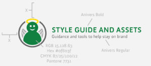
Solution: If you don’t have a brand Style Guide, consider creating one. Style Guides set the baseline expectation for your brand—THIS is the primary logo, THESE are the main colors, THIS is the preferred font. Some Style Guides are comprehensive, multi-page documents—including sample templates and guidance for writing and photography. Some of our clients have opted instead for the ease of a “quick reference style guide”, a simple 2-page cheat sheet that defines logos, fonts and colors at the most basic level.
The Caveat: A Style Guide alone can’t create a culture of brand consistency. But it is a tool that can educate and guide an organization, it can help people understand the value of strong branding, and it can be referenced when the inevitable need for enforcement comes up.
Sin #7: The Renegades
Many organizations aren’t monoliths and public agencies, in particular, have multiple departments and various initiatives. A single, overarching logo can’t reflect this diversity and people will naturally start to create their own, off-brand materials.
Solution: Consider how you can meet them halfway. Brand enforcement is easier if you have provided some support and guidance for individualism. Sometimes this is as simple as a visual strategy to subtag the logo with individual department names. Many public agencies take it to the next level by creating individualized sub-logos that leverage brand elements but use different imagery to reflect different mandates: community services, economic development, tourism, safety, etc.


